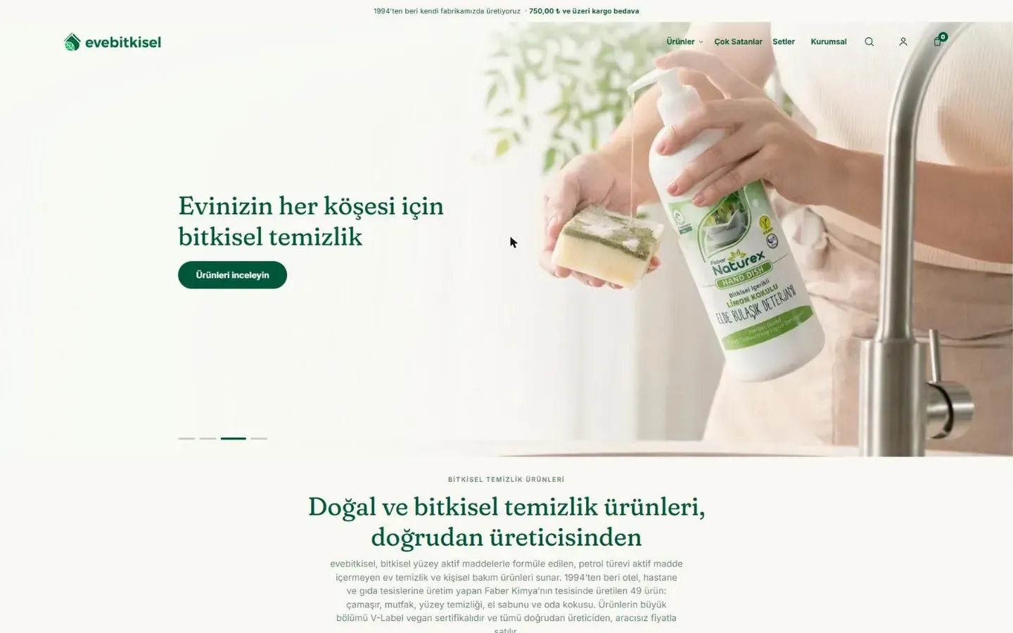
An interior architecture site whose plans open layer by layer like tracing paper, with booking in five steps.
- Sector
- Interior architecture studio (concept)
- Year
- 2026
- Services
- Websites, Search and content
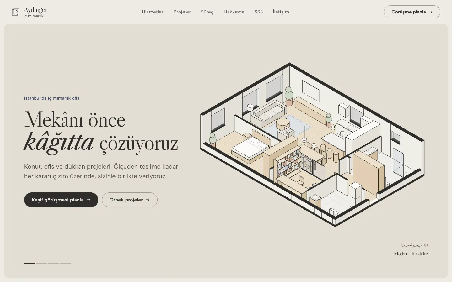
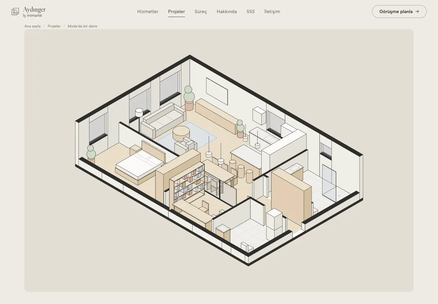
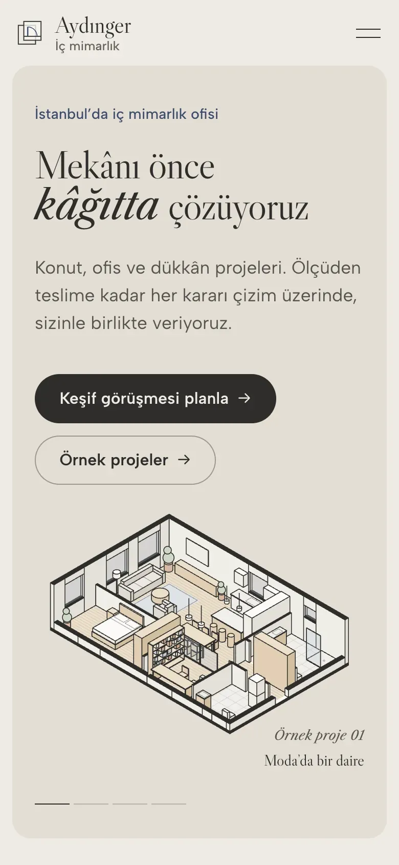
Aydınger is an interior architecture studio we invented to show our Launch package. We brought together what a service business needs on its site: a page for each service, example projects, a step-by-step booking flow and a structure Google can read. The interface uses tinted, rounded cards and serif headings with italic accents; instead of photographs, each space is told through plans, sections and axonometric drawings generated from code. Close-up views cut from the same drawings take the place photographs would usually fill.
✦ Measurement
2.0 sOn a slow mobile connection
0.4 sOn desktop, on a fast connection
Page load time
There is not a single photo on the site; every image of a space is a vector drawing generated from code. The home page weighs 186 KB, fonts and every drawing included. In Google Lighthouse’s mobile test, performance scores 99; accessibility, best practices and SEO score 100. Measured on a local production build; the site is not live.
Tools we used Astro · SVG · Schema.org · Libre Caslon · Albert Sans · Playwright · Lighthouse
✦ Context
Most interior architecture sites rely on large photographs, while the way the studio thinks stays hidden. We tried the opposite: visitors see a flat’s existing plan and new plan on top of each other, and switch furniture, lighting and dimensions on and off. Four example projects cover four scales, from a full flat to a single room; each has a plan, a section, a materials list and a sample schedule.
✦ What we did · 01
Drawings instead of photos
We wrote each space once as data, in centimetres; the plan, the section and the axonometric are all drawn from it. Move a wall and all three drawings update. No real people, brands or anyone else’s interiors appear on the site.
✦ What we did · 02
Layers like tracing paper
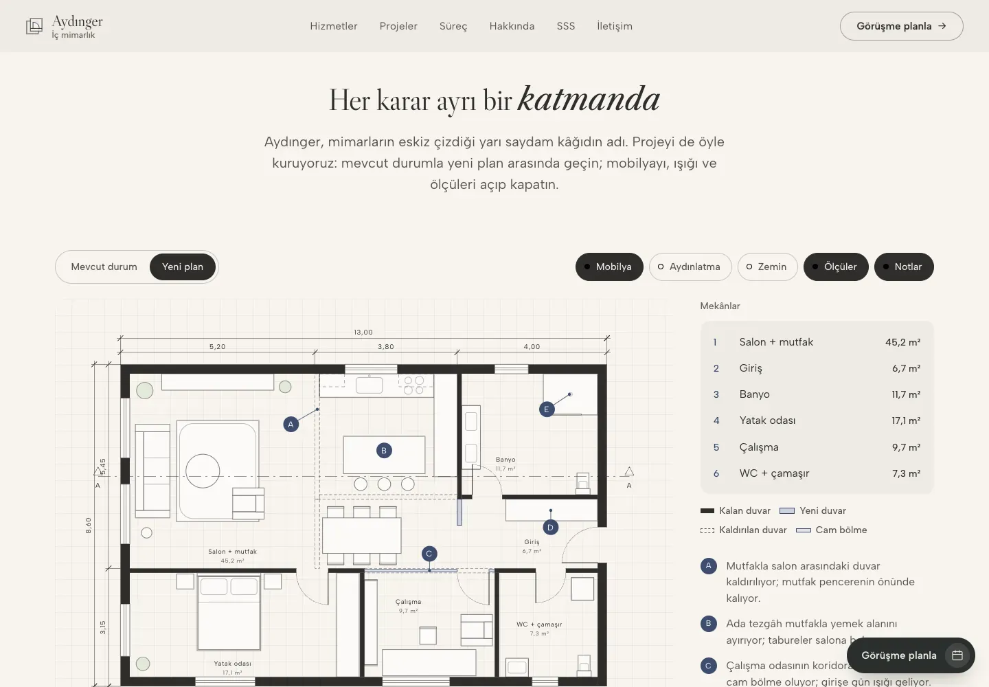
We started from the translucent paper the studio is named after. In the plan section, visitors switch between the existing condition and the new plan, and turn the furniture, lighting, flooring, dimension and note layers on and off one by one. The notes show the reason for each decision right on the plan.
✦ What we did · 03
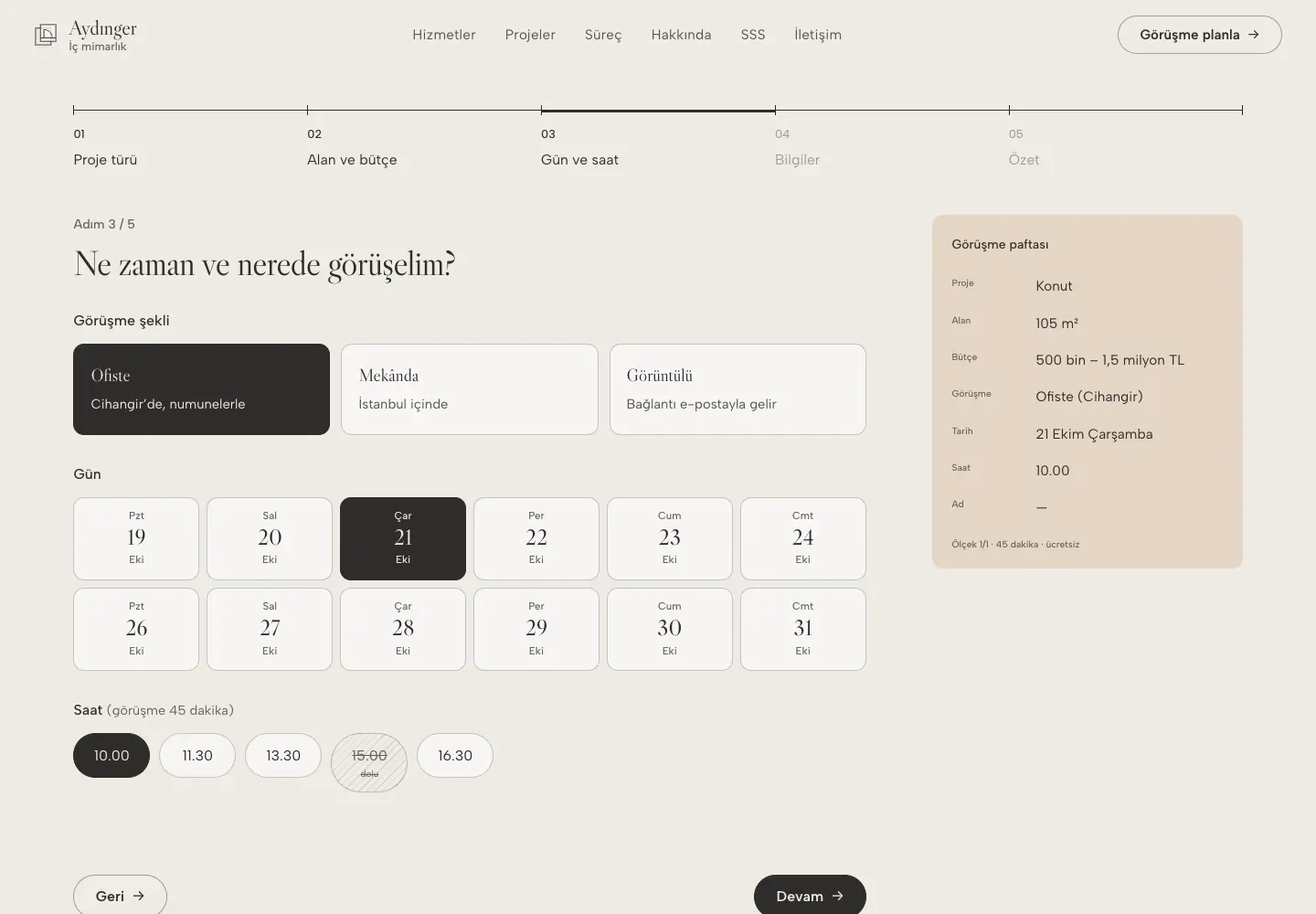
A discovery meeting in five steps
The booking flow moves through project type, area and budget, date and time, contact details and a summary. Each choice is written straight onto a “meeting sheet” at the side; once an area is picked, a rough fee appears based on example prices. The flow runs only in the browser, and the last step says plainly that nothing was sent.
✦ What we did · 04
A page for every service
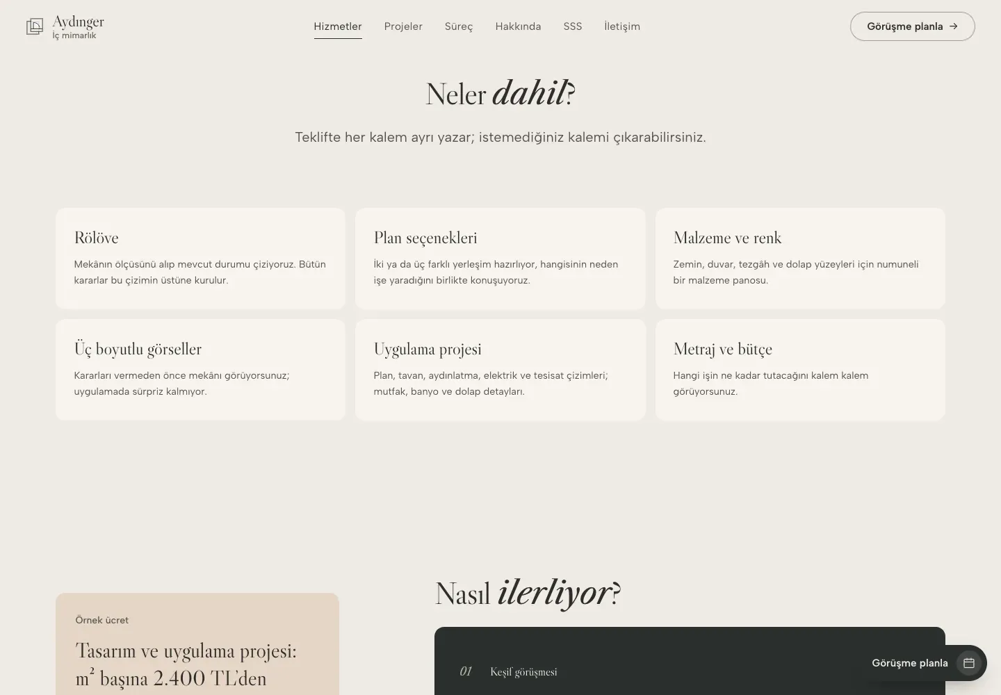
We built separate pages for residential, office and retail, renovation, and consultancy. Each covers who it is for, the scope, the steps, an example fee, a related example project and questions specific to that service. The pages are marked up so search engines can read the business, the services, the questions and the breadcrumb trail.
✦ Screens
Scroll inside to explore ↕


✦ Behind the scenes
How the drawings are made
- 01Write the space as data, in centimetres
- 02Split walls, doors and windows into layers
- 03Plan, section and axonometric from the same data
- 04Toggle the layers in the browser
- 05Share image and screenshots from one command
The drawings arrive inside the page as text, so they stay sharp at any size and need no separate download. The drawings on the project cards load only as they approach the screen.
✦ Status and outcome
Aydınger is a concept build; it has no real client and no measured business results. What it shows is the backbone of the Launch package: service pages, a booking flow that runs in the browser and a structure ready for search engines. It also shows that a space can be presented without a photo shoot, with no cost to page speed.
Looking to build something similar for your business? Get in touch here.